

- Subscribe to RSS Feed
- Mark Topic as New
- Mark Topic as Read
- Float this Topic for Current User
- Bookmark
- Subscribe
- Mute
- Printer Friendly Page
- Mark as New
- Bookmark
- Subscribe
- Mute
- Subscribe to RSS Feed
- Permalink
- Notify Moderator
Apr 20, 2022 08:12:29 AM Edited Apr 21, 2022 08:06:48 AM by Stan G
Community Revamp - 04/20/2022
Usernames are not showing as First Name, Last Initial in all spots- This has been resolved in most spots. We're working to fix the few remaining.
- Last edit/edit author is missing from forums
- Header has slight issue with margins when no announcement is present
- On mobile, the search bar on homepage is going off the page
- We're looking into adding the 'load more' button back in as an optional setting per feedback here
- Search is missing from the header (Should be next to your avatar/notifications)
Link to Upwork Profile is missing from member profilesPagination is (at times) missing for (some) membersPM and Community notifications are missingCustom tags for our moderators are missingPrivate Messages are squished when visiting the private messages page
- « Previous
-
- 1
- 2
- Next »
- Mark as New
- Bookmark
- Subscribe
- Mute
- Subscribe to RSS Feed
- Permalink
- Notify Moderator
Apr 20, 2022 03:15:00 PM by Daniil R
Is it possible to create a new group? E.g., I want to create a group for Armenia
- Mark as New
- Bookmark
- Subscribe
- Mute
- Subscribe to RSS Feed
- Permalink
- Notify Moderator
Apr 20, 2022 03:21:08 PM by Stan G
We're planning to start opening this up - I'll have the team reach out!
- Mark as New
- Bookmark
- Subscribe
- Mute
- Subscribe to RSS Feed
- Permalink
- Notify Moderator
Apr 20, 2022 03:15:57 PM by Wes C
In the utterly inconsequential category, the leaderboard is displaying two different kudo upvote counts.

- Mark as New
- Bookmark
- Subscribe
- Mute
- Subscribe to RSS Feed
- Permalink
- Notify Moderator
Apr 20, 2022 03:19:16 PM Edited May 2, 2022 01:26:55 PM by Stan G
Oh, now that's a fun one. Thanks! (We also plan to call out time period it is for and add link to leaderboards in the title!)
Edit: This has been fixed.
- Mark as New
- Bookmark
- Subscribe
- Mute
- Subscribe to RSS Feed
- Permalink
- Notify Moderator
- Mark as New
- Bookmark
- Subscribe
- Mute
- Subscribe to RSS Feed
- Permalink
- Notify Moderator
Apr 21, 2022 09:08:40 AM by Martina P
Agree! I very much dislike the leaderboard. It just entices newbies to PM these people. I get too many of those.
- Mark as New
- Bookmark
- Subscribe
- Mute
- Subscribe to RSS Feed
- Permalink
- Notify Moderator
- Mark as New
- Bookmark
- Subscribe
- Mute
- Subscribe to RSS Feed
- Permalink
- Notify Moderator
Apr 20, 2022 05:35:46 PM Edited Apr 20, 2022 05:36:59 PM by Renata S
Forgive me if someone has mentioned this. This is not a colour scheme that should continue.
I want my velociraptor back! This color scheme makes me want to bite someone's head off.

- Mark as New
- Bookmark
- Subscribe
- Mute
- Subscribe to RSS Feed
- Permalink
- Notify Moderator
Apr 21, 2022 10:03:01 AM by Douglas Michael M
In places where the old Upwork green + Upwork teal still shows up, it's far superior to any of the dizzying array of alternatives we've been subjected to so far.
- Mark as New
- Bookmark
- Subscribe
- Mute
- Subscribe to RSS Feed
- Permalink
- Notify Moderator
Apr 21, 2022 05:54:36 PM by Renata S
Douglas Michael M wrote:In places where the old Upwork green + Upwork teal still shows up, it's far superior to any of the dizzying array of alternatives we've been subjected to so far.
I hear ya.
Somebody! Can we stop here please?
This actually goes with the Upwork Green, as does that Autosaved Blue.
I might not be crazy about that one under normal circumstances, but it beats many of the alternatives.
I also quite like this color:
Have you hired a designer yet?


- Mark as New
- Bookmark
- Subscribe
- Mute
- Subscribe to RSS Feed
- Permalink
- Notify Moderator
Apr 22, 2022 07:52:16 PM by Douglas Michael M
Renata S wrote:
Douglas Michael M wrote:In places where the old Upwork green + Upwork teal still shows up, it's far superior to any of the dizzying array of alternatives we've been subjected to so far.
....Have you hired a designer yet?
I don't think that's the problem. I think that overall the revamp, bugs and hiccups aside, shows quite thoughtful design, of the form-follows-function variety.
It's a shame that all the fiddling with colors has distracted from that.
- Mark as New
- Bookmark
- Subscribe
- Mute
- Subscribe to RSS Feed
- Permalink
- Notify Moderator
May 2, 2022 01:28:32 PM by Stan G
I think we changed it over to blue everywhere. We've given up on our attempt at being cool and having a different color for each section. We didn't like the colors much either.
- Mark as New
- Bookmark
- Subscribe
- Mute
- Subscribe to RSS Feed
- Permalink
- Notify Moderator
Apr 21, 2022 09:56:26 AM by Greg W
In "Find Work", there doesn't seem to be a way of searching under "Expert", like in the previous version. The feed I see contains clients seeking people in all three categories. Before, I could filter out those looking for basic and intermediate. I prefer the older version.
- Mark as New
- Bookmark
- Subscribe
- Mute
- Subscribe to RSS Feed
- Permalink
- Notify Moderator
Apr 21, 2022 12:13:40 PM by Douglas Michael M
While we're all kvetching, here's a bone of praise:
I really like the streamlined look and feel of the top navigation area (whether it needs to be at that scale is another question), and of the posting interface.
- Mark as New
- Bookmark
- Subscribe
- Mute
- Subscribe to RSS Feed
- Permalink
- Notify Moderator
Apr 21, 2022 05:22:07 PM by Phyllis G
Thank you for restoring Feedback to the dropdown! If you'll give us Groups drop-down, I promise not to kvetch about color choices.
- Mark as New
- Bookmark
- Subscribe
- Mute
- Subscribe to RSS Feed
- Permalink
- Notify Moderator
Apr 21, 2022 05:27:04 PM by Douglas Michael M
I know you've got a few things you're still working out on the mobile interface. Having just called it up and noodled around a bit, I'm pretty impressed by how zippy it is, and how much more legible and clear.
- Mark as New
- Bookmark
- Subscribe
- Mute
- Subscribe to RSS Feed
- Permalink
- Notify Moderator
Apr 21, 2022 05:27:48 PM by Phyllis G
Kudos, schmudos, call 'em upvotes if you want. I have to say, though, it keeps reminding me of an episode of The Orville in which a landing party goes to a planet that has no gov't, just a system of public up-voting and down-voting. Everybody can instantly upvote or downvote anything that anybody does or says. Anybody who gets too many downvotes gets socially re-engineered through brainwashing. (Prolly sounds lame unless you've watched the show which is a quite entertaining (IMO) take-off on the original Star Trek.)
- Mark as New
- Bookmark
- Subscribe
- Mute
- Subscribe to RSS Feed
- Permalink
- Notify Moderator
Apr 21, 2022 10:15:39 PM by Phyllis G
In private messages, can we still block a sender? Can't find that any more (and can't remember where it was before, it was just obvious). Found "ignore" -- is that a new name for "block"? (Those two words don't mean the same thing, you know.)
- Mark as New
- Bookmark
- Subscribe
- Mute
- Subscribe to RSS Feed
- Permalink
- Notify Moderator
- Mark as New
- Bookmark
- Subscribe
- Mute
- Subscribe to RSS Feed
- Permalink
- Notify Moderator
Apr 26, 2022 06:54:50 AM by Maria T
I see you replied to Amanda regarding GIFs:
https://community.upwork.com/t5/Community-Early-Access-and/Request-remove-GIFs-from-thumbnails/m-p/1...
You could have answered here too.
Anyway, the **bleep** guy walking over and over is still there on the right. If you've removed it from other places, I'd appreciate it if you'd remove it here as well.
- Mark as New
- Bookmark
- Subscribe
- Mute
- Subscribe to RSS Feed
- Permalink
- Notify Moderator
May 1, 2022 03:16:59 AM by Maria T
I don't know if it's already been said in the thread, but I'm not going to read the whole thing again.
Stan, could you put the search back to where it was before?
It pisses me off that to search for something I have to go to the home page of the forums when before I could search anywhere I was reading.
What wonderful reason is there to change that?
- Mark as New
- Bookmark
- Subscribe
- Mute
- Subscribe to RSS Feed
- Permalink
- Notify Moderator
May 1, 2022 11:47:09 AM by Wes C
Maria T wrote:I don't know if it's already been said in the thread, but I'm not going to read the whole thing again.
Stan, could you put the search back to where it was before?
It pisses me off that to search for something I have to go to the home page of the forums when before I could search anywhere I was reading.
What wonderful reason is there to change that?
Agreed - please put the search back on the individual forum index pages so people can find it.
- Mark as New
- Bookmark
- Subscribe
- Mute
- Subscribe to RSS Feed
- Permalink
- Notify Moderator
May 2, 2022 01:31:15 PM by Stan G
I think we must have just added this back in, but it's in the header on all pages now as an icon.
We'll be testing an actual free-form search box w/ dynamic results in the near future on there. Still putting the finishing touches on that.
- Mark as New
- Bookmark
- Subscribe
- Mute
- Subscribe to RSS Feed
- Permalink
- Notify Moderator
May 3, 2022 01:20:55 AM by Maria T
Stan G wrote:I think we must have just added this back in, but it's in the header on all pages now as an icon.
We'll be testing an actual free-form search box w/ dynamic results in the near future on there. Still putting the finishing touches on that.
Thank you. I hadn't even noticed there was a "magnifying glass" there.
- Mark as New
- Bookmark
- Subscribe
- Mute
- Subscribe to RSS Feed
- Permalink
- Notify Moderator
May 2, 2022 03:56:37 AM by Maria T
Something very necessary.
Can you add the Facepalm and Shruggie emojis?
Every time I read more posts in which the only answer that comes to mind is one of those two emojis.
- Mark as New
- Bookmark
- Subscribe
- Mute
- Subscribe to RSS Feed
- Permalink
- Notify Moderator
May 2, 2022 01:33:42 PM Edited May 2, 2022 01:35:05 PM by Stan G
Eventually we do want to update them - In the mean time I was going to suggest using something like https://emojipedia.org/search/?q=face+palm but it looks like that doesn't always work - They sometimes break with the formatting
🤦
🤦:male_sign:
Edit: Super strange, the female face palm works, yet when trying to add the male face palm emoji it duplicates the female, and also adds in male:sign emoji, but when posting the latter breaks and turns into text. There must be a conflict somewhere, but that's an interesting bug
- Mark as New
- Bookmark
- Subscribe
- Mute
- Subscribe to RSS Feed
- Permalink
- Notify Moderator
May 3, 2022 01:23:25 AM by Maria T
Stan G wrote:Eventually we do want to update them - In the mean time I was going to suggest using something like https://emojipedia.org/search/?q=face+palm but it looks like that doesn't always work - They sometimes break with the formatting
🤦
🤦:male_sign:
Edit: Super strange, the female face palm works, yet when trying to add the male face palm emoji it duplicates the female, and also adds in male:sign emoji, but when posting the latter breaks and turns into text. There must be a conflict somewhere, but that's an interesting bug
I only see this:

- Mark as New
- Bookmark
- Subscribe
- Mute
- Subscribe to RSS Feed
- Permalink
- Notify Moderator
Apr 22, 2022 08:01:29 PM by Douglas Michael M
Stan G wrote:
Usernames are not showing as First Name, Last Initial in all spots
- This has been resolved in most spots. We're working to fix the few remaining.
One place I was surprised to see this was on the upvote(r) reveal page in the Freelancers forum.
While I'm here, thanks for what looks like an incidental fix: using the browser back button to return to a forum index now takes us back to where we were when we left it; this seems to be working properly everywhere I've been, after being broken for weeks or months.
- Mark as New
- Bookmark
- Subscribe
- Mute
- Subscribe to RSS Feed
- Permalink
- Notify Moderator
Apr 23, 2022 02:03:03 AM by Maria T
Stan, I would ask you to please not use animated GIFs. I'm sick of seeing that guy who advances over and over again.
I will be an old curmudgeon, but it is something that seems childish to me, it gets on my nerves and distracts me. Peripheral view is seeing it move over and over again.
- Mark as New
- Bookmark
- Subscribe
- Mute
- Subscribe to RSS Feed
- Permalink
- Notify Moderator
Apr 25, 2022 05:38:26 PM by Amanda L
Maria T wrote:Stan, I would ask you to please not use animated GIFs. I'm sick of seeing that guy who advances over and over again.
I will be an old curmudgeon, but it is something that seems childish to me, it gets on my nerves and distracts me. Peripheral view is seeing it move over and over again.
I have made the same request, but it seems to be falling on deaf ears.
- Mark as New
- Bookmark
- Subscribe
- Mute
- Subscribe to RSS Feed
- Permalink
- Notify Moderator
Apr 23, 2022 01:26:37 PM Edited Apr 23, 2022 01:28:42 PM by Peter G
What happened to the most viewed or most kudoed or most responses post list on the right of the pages that was there a couple of days ago?
- Mark as New
- Bookmark
- Subscribe
- Mute
- Subscribe to RSS Feed
- Permalink
- Notify Moderator
Apr 26, 2022 06:17:31 AM by Stan G
We're working out some kinks with what will be displayed on the right side.
You can find most of the links to the various pages here -> https://community.upwork.com/t5/Coffee-Break/Helpful-Community-links-leaderboards-unanswered-topics-...
- Mark as New
- Bookmark
- Subscribe
- Mute
- Subscribe to RSS Feed
- Permalink
- Notify Moderator
Apr 26, 2022 06:01:58 AM by Wes C
I see that the scoreboard has been replaced with the old-style scoreboard (still a waste of space, but whatever). On the forum page, the usernames come up first and are then replaced with real names. On the thread displays, the usernames come up and stay up.
- Mark as New
- Bookmark
- Subscribe
- Mute
- Subscribe to RSS Feed
- Permalink
- Notify Moderator
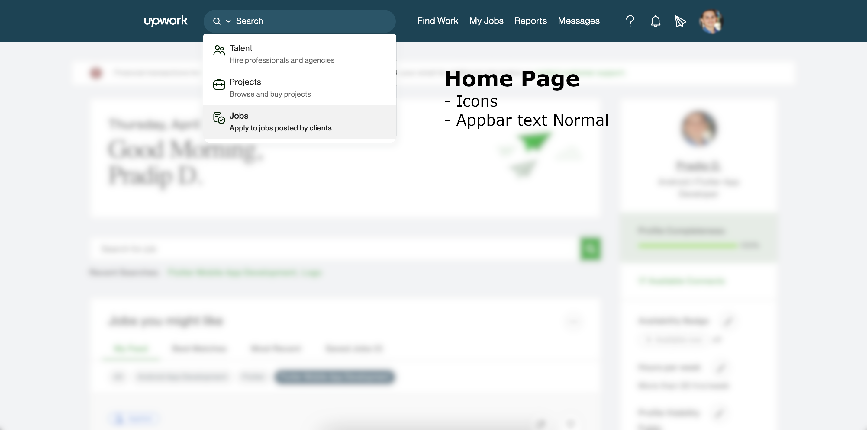
Apr 27, 2022 11:51:53 PM by Pradip D
Header's text, space and Icons(Search Dropdown) are different in home page and Job details page!
- Mark as New
- Bookmark
- Subscribe
- Mute
- Subscribe to RSS Feed
- Permalink
- Notify Moderator
Apr 30, 2022 12:30:48 AM Edited Apr 30, 2022 12:32:19 AM by Steve L
- This still happens (the Ukraine pop-up)
- Both of these still happen:
- "normal" is not the default font size for a brand new post. The default font size is actually, "Small."
- there is an [intermittent?] bug with bulleted text appearing in a smaller font size
- Both of these still happen:
- declining the survey hyperlinking to the footer
- the survey IGNORING session declines and spamming us with 30 or 40, "Tell us what you think ..." pop-ups)
- This text entry box is not resizeable, despite the misleading drag-and-drop icon in the lower right-hand corner.
- This text entry box is completely and entirely too small to write any message of value. Unless the intent is to reduce intelligible discussion down to a Tweeter-esque 280 characters.
Footnote #1: Don't do anything in popups ever again;
Footnote #2: or gigantic icons and excessive white space like the homepage;
Footnote #3: and simply get rid of the survey. Its value is non-existent.
- Mark as New
- Bookmark
- Subscribe
- Mute
- Subscribe to RSS Feed
- Permalink
- Notify Moderator
May 2, 2022 01:43:09 PM Edited May 2, 2022 02:20:32 PM by Stan G
Ukraine popup - Is this in Community or Upwork itself? We don't have any popups currently in Community. (edit - I'm wrong, we did leave this on in some spots - It's now off!)
Bullets - Checking into this one
Survey - Hyperlink to footer is unfortunately a bug in our platform itself, we're still waiting for our vendor to resolve it. While I can understand the survey popping up in multiple tabs at the same time, it should be not prompting you to take the survey again for at least 60 days after you decline it. Are you saying you are receiving it all the time, much more than every 60 days?
Text entry box resizable - I just dragged the box down and made it the entire size of my browser, when you drag it up/down nothing happens? I'm attaching photo below of how I was able to increase it a lot?

- Mark as New
- Bookmark
- Subscribe
- Mute
- Subscribe to RSS Feed
- Permalink
- Notify Moderator
May 2, 2022 11:14:42 PM Edited May 2, 2022 11:15:16 PM by Steve L
Stan G wrote:Text entry box resizable - I just dragged the box down and made it the entire size of my browser, when you drag it up/down nothing happens? I'm attaching photo below of how I was able to increase it a lot?
Apologies. Confirming the text box is resizeable and the issue is a plugin conflict. The drag-n-drop icon in the corner is blocked on this website by the Z-layer of the Grammarly plugin.
The default line display is 4 lines. I would recommend at least 8-10 lines. When quoting a thread or bulleting a list, one can't read any reasonable amount of text.
- « Previous
-
- 1
- 2
- Next »