- Subscribe to RSS Feed
- Mark Topic as New
- Mark Topic as Read
- Float this Topic for Current User
- Bookmark
- Subscribe
- Mute
- Printer Friendly Page
- Mark as New
- Bookmark
- Subscribe
- Mute
- Subscribe to RSS Feed
- Permalink
- Notify Moderator
Nov 3, 2021 11:53:08 AM by Valeria K
Redesigned Find Work Home Page: Feedback and Questions
We are redesigning the Find Work homepage to make it easier to view and manage your job feeds and profile highlights. In addition to visual updates, these changes include modernization of backend site elements. Check out the announcement here and let us know your thoughts about these updates in the comments below.

- Mark as New
- Bookmark
- Subscribe
- Mute
- Subscribe to RSS Feed
- Permalink
- Notify Moderator
Nov 3, 2021 05:01:55 AM by Fredrick A
Recently Upwork changed the design of the job feed but I realized the new feed does not automatically update when new jobs are posted like before. Is anyone else experiencing this and can it be changed to update automatically?
- Mark as New
- Bookmark
- Subscribe
- Mute
- Subscribe to RSS Feed
- Permalink
- Notify Moderator
Nov 3, 2021 05:37:14 AM by Avery O
Hi Frederick,
I looked into this for you, and I was unable to replicate your issue. I checked the feed and the latest job posts were from 7 minutes ago. Could you please try clearing your browser's cookies to see if the issue persists?
~ Avery

- Mark as New
- Bookmark
- Subscribe
- Mute
- Subscribe to RSS Feed
- Permalink
- Notify Moderator
Nov 3, 2021 05:52:10 AM by Fredrick A
Hi Avery, I mean that I have to refresh the feed manually to check if there are new jobs. In the past when a new job was posted it would show on the feed as 'there are new jobs available and when you click on that the new jobs show. If you stayed without checking for a while it would say 'there are more than 20 new jos available'. It no longer does that and so it's hard to tell when new jibs are available and when you check maybe you are too late to apply. I would like it to keep updating as it was doing before without manually refreshing so that one can know if a new job has just been posted.
- Mark as New
- Bookmark
- Subscribe
- Mute
- Subscribe to RSS Feed
- Permalink
- Notify Moderator
Nov 3, 2021 08:29:53 AM by Valeria K
Hi Fredrick,
I checked and that feature is still there. If you leave the page open and don't refresh it, this button will appear as long as there are new jobs that fit the parameters of your saved searches.

- Mark as New
- Bookmark
- Subscribe
- Mute
- Subscribe to RSS Feed
- Permalink
- Notify Moderator
Nov 3, 2021 08:54:32 AM by Woodrow Q
@Valeria!
Please pass this along to your team for correction as well.
I can no longer right-click a job title to open it in another tab with the new look.
Now, I'm forced to click the title, then on the right side of the screen, the window slides out, and at the top right corner of the job's listing is the link to open the job in a new window.
That is an extra step not needed and a time-waster.
- Mark as New
- Bookmark
- Subscribe
- Mute
- Subscribe to RSS Feed
- Permalink
- Notify Moderator
Nov 9, 2021 02:21:38 PM by Woodrow Q
Thank you Upwork!
My right-click option on the job listings is working again, and jobs are refreshing like they use to.
- Mark as New
- Bookmark
- Subscribe
- Mute
- Subscribe to RSS Feed
- Permalink
- Notify Moderator
Nov 3, 2021 09:24:04 AM by Martina P
Please upwork. Almost my whole screen is filled with a greeting. I know my name. Usually I know what day it is. Why is this change not announced in the new "feedback" section so that I can give my valuable input there for you to share with the team? Now I can't be sure you will share... please I want the old screen back, or at least lose the greeting. Thank you.
- Mark as New
- Bookmark
- Subscribe
- Mute
- Subscribe to RSS Feed
- Permalink
- Notify Moderator
Nov 3, 2021 09:42:09 AM by Fortune A
lol, actually the new update is funny though it might be of help to new freelancers to know thier way around the platform. I don't know why UW had to stop the 1 connect for submitting proposals ![]()
![]()
- Mark as New
- Bookmark
- Subscribe
- Mute
- Subscribe to RSS Feed
- Permalink
- Notify Moderator
Nov 3, 2021 09:44:17 AM by Robert Y
How come I don't get a greeting? My job feed looks the same as ever. Maybe they're trying it out on you personally as some kind of sadistice revenge.
- Mark as New
- Bookmark
- Subscribe
- Mute
- Subscribe to RSS Feed
- Permalink
- Notify Moderator
Nov 3, 2021 10:48:52 AM by Martina P
Robert Y wrote:How come I don't get a greeting? My job feed looks the same as ever. Maybe they're trying it out on you personally as some kind of sadistice revenge.
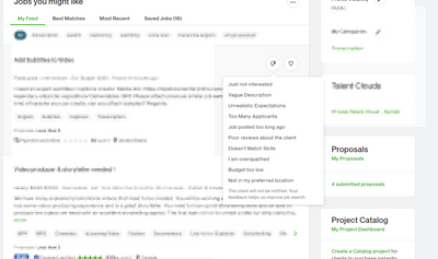
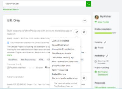
Sorry that you're not in the exclusive small number of freelancers club. I feel much better now. Yep there's a greeting and it almost fills the complete screen. Also, the dropdown why I don't like the job does opens in a way that I have to scroll up and down to get to the right reason. Not user-friendly.
- Mark as New
- Bookmark
- Subscribe
- Mute
- Subscribe to RSS Feed
- Permalink
- Notify Moderator
Nov 3, 2021 11:45:32 AM by Valeria K
Martina
Martina P wrote:
Also, the dropdown why I don't like the job does opens in a way that I have to scroll up and down to get to the right reason. Not user-friendly.
Are you referring to the drop down on my screenshot below? It may differ depending on how much you zoom in or out on your browser but generally that drop down is the same as it was in the previous experience. Here they are next to each other:
New experience
Previous experience

- Mark as New
- Bookmark
- Subscribe
- Mute
- Subscribe to RSS Feed
- Permalink
- Notify Moderator
Nov 3, 2021 10:08:53 AM by Valeria K
Hi Martina and others,
Find Work Home is being modernized for better stability and to make it easier to view and manage your job feeds and profile highlights. It's starting off as a test and is currently visible to a small number of freelancers. As we're rolling it out, we'll be sharing more information about it. Meanwhile, if you see the new layout, feel free to share your feedback here.

- Mark as New
- Bookmark
- Subscribe
- Mute
- Subscribe to RSS Feed
- Permalink
- Notify Moderator
Nov 3, 2021 11:45:59 AM by Wes C
Valeria K wrote:Hi Martina and others,
Find Work Home is being modernized for better stability and to make it easier to view and manage your job feeds and profile highlights. It's starting off as a test and is currently visible to a small number of freelancers. As we're rolling it out, we'll be sharing more information about it. Meanwhile, if you see the new layout, feel free to share your feedback here.
I just reloaded and got this... thing.
First, something good: it now defaults to "My Feed" instead of US Only. And I like that you've moved the left-hand menu to the other side.
But please, lose the banner. It's completely unnecessary and takes up far too much real estate. I have to scroll to see the first job. Like Martina, I know my name (usually). In case I forget, you've put it over on the right-hand menu too. And, I really don't need to be reminded it's already afternoon.
As Woodrow said, please bring back the ability to right-click to open a job on a new tab.
As is often the case, the changes to "make things easier" actually add steps to processes we do multiple times a day. That's the opposite of easier.
- Mark as New
- Bookmark
- Subscribe
- Mute
- Subscribe to RSS Feed
- Permalink
- Notify Moderator
Nov 3, 2021 02:02:58 PM by Valeria K
Thanks for your feedback, Woodrow, Wes, and others, I've shared it with the team. They are working on bringing up the option to right-click a job title to open it in another tab to the new design.

- Mark as New
- Bookmark
- Subscribe
- Mute
- Subscribe to RSS Feed
- Permalink
- Notify Moderator
Nov 3, 2021 03:56:55 PM by Woodrow Q
Hello Valeria!
Valeria K wrote:Thanks for your feedback, Woodrow, Wes, and others, I've shared it with the team. They are working on bringing up the option to right-click a job title to open it in another tab to the new design.
After further review of the new look here are a few of my bad and good points.
👎 Bad: This banner area is not necessary. I do not need to read my name or see my picture, let alone see my name twice. It is redundant content and provides no practical value when I'm searching for jobs. I only want to see the list.
👎 Bad: I also have a computer that clearly lets me know the time, date, and if it's AM or PM. Have your team remove this because it is a huge distraction and wasted space.
👎 Bad: Here again is redundant content. These links are still up in the header area and I do not need another reminder. It too is a huge distraction and provides no practical value.
_____________________________________
👍 Good: This is a better layout, and I like that it is wider.
👍 Good: I like that this section is now horizontal and no longer vertical. And frankly, this area should be in the banner area instead, because we Business Owners are here and ready to get down to business.
Please pass this along to your team as well.
- Mark as New
- Bookmark
- Subscribe
- Mute
- Subscribe to RSS Feed
- Permalink
- Notify Moderator
Nov 4, 2021 10:28:27 AM by Valeria K
Woodrow, Anna, and others,
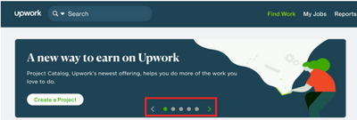
A few of you noted that the new banner at the top of the Find Work homepage takes up more space than may seem necessary. While that area currently displays only a greeting, this section is actually a carousel that will be used to get the most important information in front of talent. (I'd also like to note that various banners would appear on that page before at different stages of profile creation and to inform talent about major updates and releases. They'll just be shown in a more compact way in a carousel.)
Below is a screenshot of how this will look going forward:

- Mark as New
- Bookmark
- Subscribe
- Mute
- Subscribe to RSS Feed
- Permalink
- Notify Moderator
Nov 4, 2021 10:42:23 AM by Maria T
Valeria K wrote:Woodrow, Anna, and others,
A few of you noted that the new banner at the top of the Find Work homepage takes up more space than may seem necessary. While that area currently displays only a greeting, this section is actually a carousel that will be used to get the most important information in front of talent. (I'd also like to note that various banners would appear on that page before at different stages of profile creation and to inform talent about major updates and releases. They'll just be shown in a more compact way in a carousel.)
Below is a screenshot of how this will look going forward:
Well that could be at right just like here in the forum. If any information that is redundant is removed.
- Mark as New
- Bookmark
- Subscribe
- Mute
- Subscribe to RSS Feed
- Permalink
- Notify Moderator
Nov 4, 2021 11:03:17 AM by Wes C
Valeria K wrote:Woodrow, Anna, and others,
A few of you noted that the new banner at the top of the Find Work homepage takes up more space than may seem necessary. While that area currently displays only a greeting, this section is actually a carousel that will be used to get the most important information in front of talent. (I'd also like to note that various banners would appear on that page before at different stages of profile creation and to inform talent about major updates and releases. They'll just be shown in a more compact way in a carousel.)
While that makes more sense than the current welcome banner, I don't think it's going to be very useful given that the screen has to be scrolled up, hiding the carousel, to get to the job feed. I suggest moving it to the right-hand side, like in the forum, so there's at least a chance it will be visible long enough for people to notice it before scrolling it off the page.
- Mark as New
- Bookmark
- Subscribe
- Mute
- Subscribe to RSS Feed
- Permalink
- Notify Moderator
Nov 4, 2021 11:14:40 AM by Woodrow Q
Hello Valeria!
Valeria K wrote:Woodrow, Anna, and others,
A few of you noted that the new banner at the top of the Find Work homepage takes up more space than may seem necessary. While that area currently displays only a greeting, this section is actually a carousel that will be used to get the most important information in front of talent. (I'd also like to note that various banners would appear on that page before at different stages of profile creation and to inform talent about major updates and releases. They'll just be shown in a more compact way in a carousel.)
I have to agree with Wes. Job listings are more important than banner activity. The job listings are your primary products that sell. Information has its place, but not above job listings. Take a lesson from Walmart.
Every square inch of selling real estate is only meant to sell, not inform. Your job listings are your most valuable commodity. Those listings must always remain at the top, unobstructed from view or distractions.
You want us Business Owners, Professional Freelancers, & Independent Professionals to focus on submitting proposals in this space. You never want us to turn away because you risk us not returning and the platform loses a potential sale.
- Mark as New
- Bookmark
- Subscribe
- Mute
- Subscribe to RSS Feed
- Permalink
- Notify Moderator
Nov 3, 2021 09:36:38 AM by Fredrick A
@Valeria,
Unfortunately, it is not doing so on my end and I am not sure why that is so?
- Mark as New
- Bookmark
- Subscribe
- Mute
- Subscribe to RSS Feed
- Permalink
- Notify Moderator
Nov 3, 2021 09:41:08 AM by Goran V
Hi Fredrick,
Just to confirm, are you using a computer or a mobile device? I would recommend logging in via a computer to view your job feed and your saved search results.
You can also remove your current ones and add them again. If you're still experiencing any problems after this, feel free to follow up here. Thank you.

- Mark as New
- Bookmark
- Subscribe
- Mute
- Subscribe to RSS Feed
- Permalink
- Notify Moderator
Nov 3, 2021 10:32:42 AM by Fredrick A
@Goran,
I am using my laptop and not a mobile phone. I have removed my search results and saved them again but still not accessing the feature.
- Mark as New
- Bookmark
- Subscribe
- Mute
- Subscribe to RSS Feed
- Permalink
- Notify Moderator
Nov 3, 2021 02:05:31 PM by Valeria K
Fredrick A wrote:
@Goran,
I am using my laptop and not a mobile phone. I have removed my search results and saved them again but still not accessing the feature.
Fredrick, thanks for following up. The team is looking into this now.

- Mark as New
- Bookmark
- Subscribe
- Mute
- Subscribe to RSS Feed
- Permalink
- Notify Moderator
Nov 3, 2021 02:16:51 PM by Maria T
And all the information in the first block on the right, what for?, apart from reminding me of the connects I have available what is fine, it only takes up space.
Since I am the one looking for jobs, I know who I am, what I do, what my skills are, my availability and visibility and my categories.
- Mark as New
- Bookmark
- Subscribe
- Mute
- Subscribe to RSS Feed
- Permalink
- Notify Moderator
Nov 4, 2021 10:12:53 AM by Valeria K
Maria T wrote:
And all the information in the first block on the right, what for?, apart from reminding me of the connects I have available what is fine, it only takes up space.
Since I am the one looking for jobs, I know who I am, what I do, what my skills are, my availability and visibility and my categories.
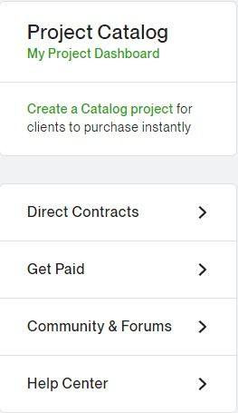
Thanks for your feedback, Maria. I'd like to note though, that the information about Availability, Profile Visibility, Categories, Catalog Projects, profile link was on this page in the previous layout as well. Some of them just used to be on the left-hand side and are now moved to a more compact view on the right-hand side. Since this page doesn't only contain the Job Feed, but also is the home page the freelancer lands on when they log into their account, we find that that information needs to be easily accessible there. In fact, some of these settings, like Availability, are only accessible from this page. I don't expect this to change.

- Mark as New
- Bookmark
- Subscribe
- Mute
- Subscribe to RSS Feed
- Permalink
- Notify Moderator
Nov 4, 2021 10:32:47 AM by Maria T
Valeria K wrote:
Maria T wrote:And all the information in the first block on the right, what for?, apart from reminding me of the connects I have available what is fine, it only takes up space.
Since I am the one looking for jobs, I know who I am, what I do, what my skills are, my availability and visibility and my categories.Thanks for your feedback, Maria. I'd like to note though, that the information about Availability, Profile Visibility, Categories, Catalog Projects, profile link was on this page in the previous layout as well. Some of them just used to be on the left-hand side and are now moved to a more compact view on the right-hand side. Since this page doesn't only contain the Job Feed, but also is the home page the freelancer lands on when they log into their account, we find that that information needs to be easily accessible there. In fact, some of these settings, like Availability, are only accessible from this page. I don't expect this to change.
Thanks Valeria. But please, at least make the heading, where we can change our search and do new searches, stay fixed, and only move the job listing. Really, that is very uncomfortable.
- Mark as New
- Bookmark
- Subscribe
- Mute
- Subscribe to RSS Feed
- Permalink
- Notify Moderator
Nov 4, 2021 11:11:04 AM Edited Nov 4, 2021 11:15:43 AM by Maria T
Valeria K wrote:Thanks for your feedback, Maria. I'd like to note though, that the information about Availability, Profile Visibility, Categories, Catalog Projects, profile link was on this page in the previous layout as well. Some of them just used to be on the left-hand side and are now moved to a more compact view on the right-hand side. Since this page doesn't only contain the Job Feed, but also is the home page the freelancer lands on when they log into their account, we find that that information needs to be easily accessible there. In fact, some of these settings, like Availability, are only accessible from this page. I don't expect this to change.
Well, now I understand why Upwork try to put so much information on the "Find a job" page
I didn't remember that this is the page that is reached when you log in.
Instead of making an entry page where you can have the information that they think is important for "new freelancer" and choose where you want to go, Upwor prefers to make the most used page as awkward as possible 😡
ETA.- And in case you haven't seen it, the page is so full of things that, of what is important here, the list of jobs, we can only see 1, the first.
- Mark as New
- Bookmark
- Subscribe
- Mute
- Subscribe to RSS Feed
- Permalink
- Notify Moderator
- Mark as New
- Bookmark
- Subscribe
- Mute
- Subscribe to RSS Feed
- Permalink
- Notify Moderator
Nov 3, 2021 10:22:37 AM by Susan S
The new landing page has some quirks. When you click on a job listing, the new page for the listing only opens half way. Also, it's showing that I have four saved jobs. How do I get rid of those? Also, some job listings are repeated multiple times. I tried to leave a screenshot here, but apparently it isn't the right format. It's a docx file.
- Mark as New
- Bookmark
- Subscribe
- Mute
- Subscribe to RSS Feed
- Permalink
- Notify Moderator
Nov 3, 2021 11:15:37 AM by Valeria K
Hi Susan,
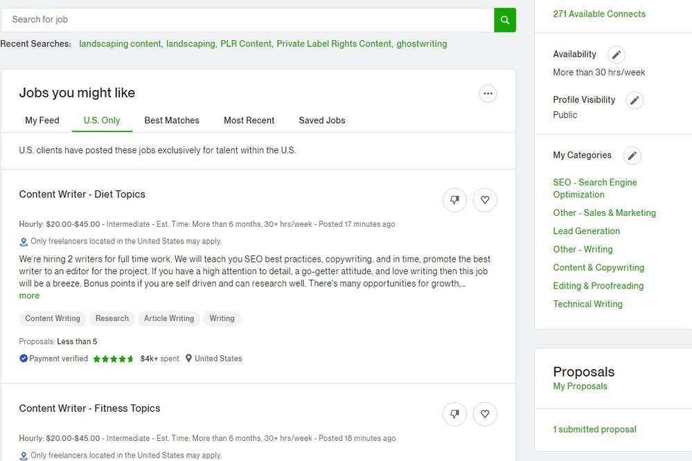
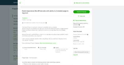
Thanks for sharing your feedback! The job posting opening in a slider half way isn't new. The previous experience had it working in the similar way. Except for now, you won't see the empty space on the right hand side. This is what it looks like in the previous experience:
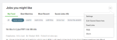
As for removing saved searches, check out my screenshot below. You'll see the menu button that has an option to Edit Saved Searches.
I haven't been able to replicate the issue you're describing with jobs showing as duplicates. If you could send me a private message with a screenshot, that's be great!

- Mark as New
- Bookmark
- Subscribe
- Mute
- Subscribe to RSS Feed
- Permalink
- Notify Moderator
- Mark as New
- Bookmark
- Subscribe
- Mute
- Subscribe to RSS Feed
- Permalink
- Notify Moderator
Nov 5, 2021 07:36:00 AM by Valeria K
Susan,
Could you please click on one of your saved searches in that area and then click on the menu. Edit Saved Searches option should appear.
This is actually something the team is going to address and make sure Edit Saved Searches will appear even when "All" is selected.

- Mark as New
- Bookmark
- Subscribe
- Mute
- Subscribe to RSS Feed
- Permalink
- Notify Moderator
Nov 5, 2021 02:48:49 PM by Susan S
I'm trying to delete saved jobs. There are four jobs that are no longer available.
- Mark as New
- Bookmark
- Subscribe
- Mute
- Subscribe to RSS Feed
- Permalink
- Notify Moderator
Nov 5, 2021 02:56:44 PM by Goran V
Hi Susan,
Are you experiencing any problems with this? All you need to do to remove a saved job is to go to the Saved Jobs tab and click on the heart icon. If the job is not removed on your end, could you try to clear your cache and cookies and then try to remove it again? Thank you.

- Mark as New
- Bookmark
- Subscribe
- Mute
- Subscribe to RSS Feed
- Permalink
- Notify Moderator
Nov 6, 2021 10:40:34 AM Edited Nov 7, 2021 02:44:31 AM by Maria T
Hey! Has QUOTE disappeared?
Okay, I found it.
But why is it hiding? It is a function that is used a lot.
- Mark as New
- Bookmark
- Subscribe
- Mute
- Subscribe to RSS Feed
- Permalink
- Notify Moderator
Nov 7, 2021 02:49:13 AM by Maria T
Any mod?
Please put QUOTE back where it was before.
Now to quote you have to open "Expand Toolbar" in the three points, and it is something that is difficult to find.
- Mark as New
- Bookmark
- Subscribe
- Mute
- Subscribe to RSS Feed
- Permalink
- Notify Moderator
Nov 7, 2021 03:31:39 AM by NikolaS N
Hi Maria,
I would like to let you know that our team is aware of the issue and we are working on fixing this as soon as possible.

- Mark as New
- Bookmark
- Subscribe
- Mute
- Subscribe to RSS Feed
- Permalink
- Notify Moderator
Nov 7, 2021 03:33:10 AM by Maria T
Nikola S wrote:Hi Maria,
I would like to let you know that our team is aware of the issue and we are working on fixing this as soon as possible.
Thanks Nikola!
- Mark as New
- Bookmark
- Subscribe
- Mute
- Subscribe to RSS Feed
- Permalink
- Notify Moderator
Nov 3, 2021 11:40:34 PM by Shamila I
Hi Valeria
I am having the same problem that Frederick mentioned. After experimenting and waiting etc the feed does not refresh or offer up 'new jobs available'.

