We and selected third parties use cookies or similar technologies for technical purposes, to enhance site navigation, analyze site usage, assist in our marketing efforts, and for other purposes as specified in the Cookie Policy.
Dec 29, 2022 12:02:47 AMEditedDec 29, 2022 01:34:34 AM by Pradeep H
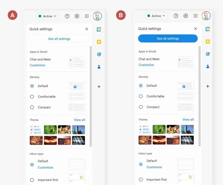
UI button in Gmail
A comparative analysis of a UI button in Gmail I have provided two screenshots featuring the 'See all settings' buttons, denoted as options A and B. Option A features a button with a light grey outline and blue text, while option B features a button with a blue fill and white text. Which of these options do you prefer? Without reviewing Gmail, which button is the original? This exercise aims to understand which option users prefer and to see if the majority opinion aligns with Gmail's approach. Remember to look at your Gmail and double-check what option they use. Please find the attachment.
Without looking I went for the opition B then I checked that is not the original. I think that option in blue is better because invites you to see all the options in a better way, which is maybe a button that I personally look for when reviewing settings


